Gnome2/MATE desktop
Nice Features
(especially the top panel)
(mistakenly abandoned by
Gnome3, Ubuntu, others)
Gnome2/MATE desktop
Nice Features
|
|
(2014 Jan blog post)
!Note!
Some information and links may be added,
or updated, if I re-visit this page.
|
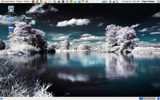
INTRODUCTION: This page will have meaning to Linux users who have used the Gnome 2 (or MATE ) 'desktop environment' and who then observed the release of Gnome 3 around 2011 and found that many of the nice productivity and efficiency features of Gnome 2 were abandoned in Gnome 3. For people who have not used a Gnome desktop environment, this page may be of use to those who are looking for a good 'desktop environment' for Linux --- one that is suited to their work-flow. I switched over from Microsoft Windows to Linux in 2009. I switched to Ubuntu 9.10 (the 2009 October version, 'Karmic Koala') Linux. Ubuntu 9.10 used the Gnome 2 'desktop environment'. I was used to having a thin rectangular 'panel' along the bottom of the Microsoft Windows desktops (circa 2000-2009). In that panel, running programs (tasks) were indicated by a small rectangle (for each task), containing some abbreviated text indicating what application was running. The Microsoft Windows desktop also allowed for icons to be placed on the large rectangular 'desktop', covering most of the screen. The icons could represent programs (applications) such as web browsers, mail readers, image editors, word processors, etc. Also the icons could represent files such as HTML files, word processor files, plain text files, PDF files, etc. The Gnome 2 desktop of Ubuntu 9.10 had a bottom panel that worked the same way as the Microsoft Windows bottom panel --- to show running programs. And the Gnome 2 user could also place app-and-file icons on the desktop. You can see an example of the Gnome 2 desktop in the image in the title block at the top of this page. You can see a nearly empty bottom panel along the bottom of that image. And you can see several icons on the top-left of the large desktop area. Here is an example image of a Gnome 2 bottom panel in action --- showing several instances of the Nautilus file manager running, an instance of the Seamonkey web browser, an instance of the Filezilla FTP client program, and an instance of the Scite text editor. |

For this image (and for most of the images below),
you can click on the image to show a larger image.
You may need to use the Back button of your
web browser to return to this web page.
|
Instances of the Nautilus file manager are indicated by the icon which looks like a folder with an arrowhead on top. The Nautilus file manager is included as part of the Gnome 2 desktop environment. The file manager is closely linked to some aspects of the desktop, such as the 'Bookmarks' feature of the 'Places' option in the top panel of the Gnome 2 desktop environment. On the far-left of the bottom panel, there is an icon to quickly 'hide' all windows and show the desktop. On the far-right of the bottom panel, there is a Trash icon. (I hardly ever use either of those icons. I activated a Delete option in the Nautilus file manager so that I can immediately delete files when I wish --- which is more than 99% of the time. This way the files do not take space in a Trash folder, and multiple steps are not required to delete the files.) The Top Panel In addition to the bottom panel, the Gnome2/MATE desktop also has (or had, in the case of Gnome2 --- R.I.P.) a top panel. There was no such second, top panel in the default Microsoft Windows desktop environment. At first, in coming from a Microsoft desktop environment, I thought that I would not like the top panel, because it just took up screen space. When application windows opened, they were confined between the top and bottom panels. Since each of the two panels was about 25 pixels high, the windows were deprived of about 50 vertical pixels when windows were at their maximum size. I thought I would prefer to have that 25 pixels occupied by the top panel. But this top panel allowed for *QUICK* access to many nice utilities and file locations via
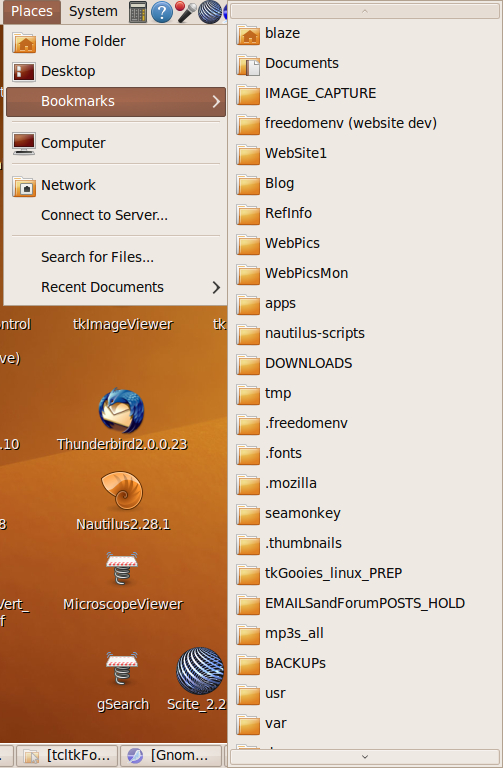
By far, I use the 'Places', 'Network Manager', and 'on-off' features of the top panel the most. And it is nice to have quick access to the audio volume control, in cases of high-volume audio suddenly playing. Since I do a lot of web page authoring and program development (namely, scripts - shell and Tcl-Tk), I soon found that the 'Places' pop-down was one of my favorite features. Its 'Bookmarks' feature, which allowed me to add 'favorite' directories, by using a 'Bookmarks > Add Bookmark' toolbar item of the Nautilus file manager, made it quite efficient for me to navigate quickly to a 'development' directory --- or to go to 'test files' and 'reference material' directories. Here is an example image of the Gnome 2 top panel. |

Click for a larger image
in a separate window/tab.
|
The following 3 images show example pop-down menus for 'Applications', 'Places', and 'System'.
I find that I do not use the 'Applications' menu much, because there are about 8 applications that I use the most, and I have them set up as icons on the desktop and/or in the top panel. It is much faster to start them up that way. In the top panel image above, it can be seen that I added icons for applications, including
I find that I use the 'Places' menu heavily --- the 'Bookmarks' feature by far the most. You can see in the image above that you can have many directories bookmarked. You can see a little arrow at the bottom of the list, indicating that you can scroll down to even more bookmarks.
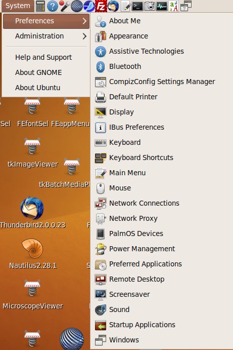
I find that I used the 'System' menu (above) mainly when first configuring my Ubuntu installation. In the 'Preferences' group, I mainly used the 'Display' and 'Mouse' options. In the 'Administration' group, I mainly used the 'Printing' option --- and the 'Synaptic Package Manager' option when the 'Ubuntu Software Center' (of the 'Applications' drop-down menu) was lacking. I use the 'System Monitor' option frequently enough that I added it as an icon on the top panel. In addition to the 'Places' (and 'System' and 'Applications') drop-down menus of the top panel, I find the 'Network Manager' icon of great use --- to quickly break-off or establish a network connection when I want to. (This is certainly not something that Google wants to encourage in their Chromebook/Android operating system. The Chromebooks are a definite slap in the face of those who value free-choice in their operating systems. Google is financially motivated to require their users to run a gauntlet of advertisements, with every operation the user performs.) On the top panel, I think it is nice that the 'on-off' icon makes it pretty easy for a new user to find how to shutdown the computer. Microsoft seems to delight (especially in Windows 8) in hiding things like 'network-manager' controls and 'on-off' buttons --- and delight in making it a multi-multi-step process to reach such important features. The Abandonment (of reason) I plan to collect on a different web page many of the user reactions to the Gnome 3 desktop --- in particular, comments on very useful features that were taken away or 'hidden'. I will put a link to that page here, when I put it in place. For now, you can find many such Gnome3 user comments via this web search on the keywords gnome 3 complaints. One of the most common complaints that I saw, repeatedly, was that it took more mouse-clicks in Gnome3 to do what had been quick to do in Gnome2. (Another common complaint is that a feature was removed --- or no longer worked due to coding changes.) In fact, the following comment from a Gnome 3 reviewer gives a pretty good summary: "If you 'upgrade' to GNOME 3, you will almost certainly lose any semblance of work flow." Gnome 3 developers seem to be in denial. Their common response is that 'These people do not like change.' The developers seem to be totally oblivious to the fact that these people were talking about operations that they were performing hundreds of times in a login session. If it took 3 seconds longer to do what they had done before, that amounted to many minutes (about 200 operations x 3 seconds = 10 minutes) of wasted time for them --- not to mention the god-awful frustration, because they knew that the extra steps were unnecessary. It did not need to be that way. It was caused by poor design decisions in Gnome3. Furthermore, many features that users found quite useful were removed or no longer worked --- and the developers did not care that they did not work, because they thought the users should work in a different (more inefficient) way. Amazingly, the Gnome3 developers invariably could not understand that that inefficient way was not a good answer. I plan to collect on a different web page many of the Gnome 3 developer responses to user complaints --- like variations on the "they don't like change" cop-out. I will put a link to that page here, when I put it in place. For now, you can find many such Gnome3 'clueless developer' responses via this web search on the string gnome 3 "don't like change". A typical user response to the infuriating "you don't like change" conditioned response of the Gnome3 developers: "I just don't like change that sucks! I really really really want to like Gnome 3." An observation by one reviewer of Gnome3: "What makes all of this worse is the way GNOME dismisses the complaints, chalking it up to the fact that people don't like change ..." Mark Shuttleworth, the main-decider behind Ubuntu, decided to develop a new 'Unity' desktop environment for Ubuntu --- rather than adopt Gnome 3 as the desktop system for Ubuntu. But 'Unity' has suffered many of the same complaints that Gnome 3 has suffered --- namely, features 'hidden' (and harder to get to) and features simply not available anymore --- and changed methods of operation that are not conducive to some users' 'work flow'. In fact, Ubuntu used to be at the top of the distrowatch.com ratings in the couple of years (about 2007 to 2009) before Ubuntu switched from Gnome 2 to the 'Unity' desktop. But the 'Linux Mint' distro went to the top of the ratings, because 'Linux Mint' decided to use Gnome 2 for a couple of more releases --- in spite of the fact that Linux Mint is built off of the Ubuntu releases, on the same 6-month new-release schedule that Ubuntu uses. And the main Linux Mint developer, Clem Lefebvre, worked with a group of Argentinians who decided to 'fork' the Gnome 2 code --- including the Nautilus file manager --- into a desktop system they named MATE which has a web-site at mate-desktop.org. At the same time as offering Gnome 2 (and then MATE) in Linux Mint, Clem started developing a new desktop he calls 'Cinnamon' that was originally based on Gnome 3. He has been restoring some of the operating features of Gnome 2 in 'Cinnamon'. In the 2014 releases of Linux Mint (Cinnamon edition), some of the underlying Gnome 3 utilities have been replaced by code under the control of the Linux Mint developers --- so that they have more freedom to diverge from the unpopular choices that Gnome3 developers have been making. Linux Mint desktop missing the top panel nimbleness Although Linux Mint has been more sensitive to user complaints than the Gnome 3 developers (and Ubuntu Unity developers), I find it unfortunate that Clem Lefebvre decided early in the development of a unique desktop environment for Linux Mint that he would forego the top panel of Gnome 2. Instead of the 'Places' and 'Application' and 'System' drop-down menus, he has implemented a 'monolithic' panel that pops up from the bottom-left of the bottom panel (a Start-button-like pop-up). In my experiences with installing a couple of versions of Linux Mint in the 2011-2012 time frame, that start-panel is much more sluggish in behavior than the Gnome2 'Places' and 'Application' and 'System' drop-down menus. Futhermore, that approach brings up much more baggage than I would usually need. As I mentioned above, I use the 'Places' menu far more than the 'System' and 'Applications' menus --- yet with the Linux Mint menu, the user is presented with all those items, even though a user will not need the whole 'schmear'. I think the Linux Mint 'Cinnamon' approach is too heavy-weight and slow. I like the light and nimble top panel of Gnome 2. For example, the 'Places' and 'Network Manager' options are always available, via a single click. I do not have to bring up a 'monlithic' menu from which to choose those options. Furthermore, I have a set of more than 400 Nautilus scripts that I have developed, many of which I use almost daily within the Nautilus file manager. The MATE developers have forked the Nautilus file manager. They call their fork 'Caja' - Spanish for 'box'. So far (in 2013), the MATE developers seem to have preserved the 'Nautilus Scripts' capability. Clem Lefebvre is also developing a file manager he calls 'Nemo' for the Cinnamon environment. It is also probably based on Gnome 2 Nautilus code, but he does not seem to have made a committment to preserving the 'Nautilus Scripts' capability. My Hopes It is my hope that the 'Nautilus Scripts' capability is preserved in the file managers of MATE and Cinnamon --- Caja and Nemo. I am hoping that the MATE developers are successful in restoring some of the regressions that have appeared in the Nautilus file manager since the 2.28 version. (They seem to have forked from a version after the 2.28 version.) I am hoping that the MATE developers do not introduce so many bugs in the MATE desktop environment that the 'fork' is doomed to failure. In other words, I hope that the MATE project can always find good system-designers and code-developers. I hope that Clem Lefebvre will someday replace the current monolithic-start-menu-popup of the 'Cinnamon' desktop with a more nimble replacement --- more like the top panel of the Gnome 2 desktop environment --- with 'Places' and 'Network Manager' and 'on-off' and 'audio volume control' available in a single click. Gnome 3 and Ubuntu Unity - Ignoring the Apple Approach It seems pretty amazing to me how Gnome 3 developers and Ubuntu Unity developers seem to be charging ahead with new one-size-fits-all desktop environments --- for phones, laptops, desktops, and everything below, above, and beyond. Gnome3 and Ubuntu-Unity developers seem to be oblivious to the fact that Apple did not jettison their desktop 'Mac' OS X operating system when Apple came out with the 'iPhone' and 'iPad' operating sytems that are oriented toward 'finger-tip' operations rather than mouse operations. Apple seems to be quite aware that their Mac systems are used by many media developers (graphic artists, musicians, movie makers, 3D modelers, etc.) whose work flow would be adversely impacted if they suddenly switched operating environments on their users. While Apple will probably migrate its 'Mac' and 'iPhone' and 'iPad' operating systems to a common code base eventually, Apple seems to have realized that it would not be a good idea to try to do that in a 6 month period --- or even a 2 year period. Gnome 3 planners and Ubuntu-Unity planners do not seem to have the respect for their users that Apple (and Linux Mint) planners have for their users. This is unfortunate, because Linux seemed to be on the verge of winning the desktop wars within the 2013 to 2015 time frame. But the Gnome2-to-Gnome3 fiasco has knocked that likelihood into the far future --- probably years beyond 2015. It is encouraging that in Europe, there are several large Microsoft-to-Linux conversions going on
But this Gnome2-to-Gnome3 fiasco is definitely going to result in a far slower Microsoft-to-Linux conversion than what we would have seen if many Gnome 2 features had been kept --- in other words, if the Gnome3 and Ubuntu-Unity tangents had not diverted the 'flow' of Gnome 2. An observation on file managers It is amazing to me how many articles on Linux desktop systems (and evaluations of desktops in Linux magazines) do not even mention (much less evaluate) the file manager that typically comes with the desktop environment. The file manager is the 'app' that I use the most --- probably more than a web browser or a mail reader or an image viewer or an image editor. And I find it amazing that I have never seen anyone mention that Microsoft --- lo these many years, from about 1995 to the present --- has always thought a reliable file manager was so important that they always have shipped TWO with their operating system: the one that comes via the 'Computer' icon and the one that was called 'Windows Explorer' for many, many years. I think that is a major Achilles heel of Linux. No distro thinks the file manager is important enough to furnish TWO file managers with the distro --- two SOLID, RELIABLE file managers --- but one as a backup to the other, just in case. I do not think we will find Linux winning the desktop wars until we see TWO ROBUST file managers delivered with the most popular distro (--- and until U.S. tax software, like Turbotax, is available on Linux). |
|
Bottom of this page on the
To return to a previously visited web page location, click on the
Back button of your web browser, a sufficient number of times.
OR, use the History-list option of your web browser.
< Go to Top of Page, above. >Or you can scroll up, to the top of this page. Page history:
Page was posted 2014 Jan 22.
|