World Population Growth Charts
MORE Than Exponential
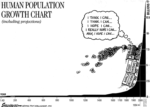
World Population Growth ChartsMORE Than Exponential |

|
(2009 Jan blog post)
! Note !
More world-maps, graphs, and reference-data
links MAY be added, if I re-visit this page.
|
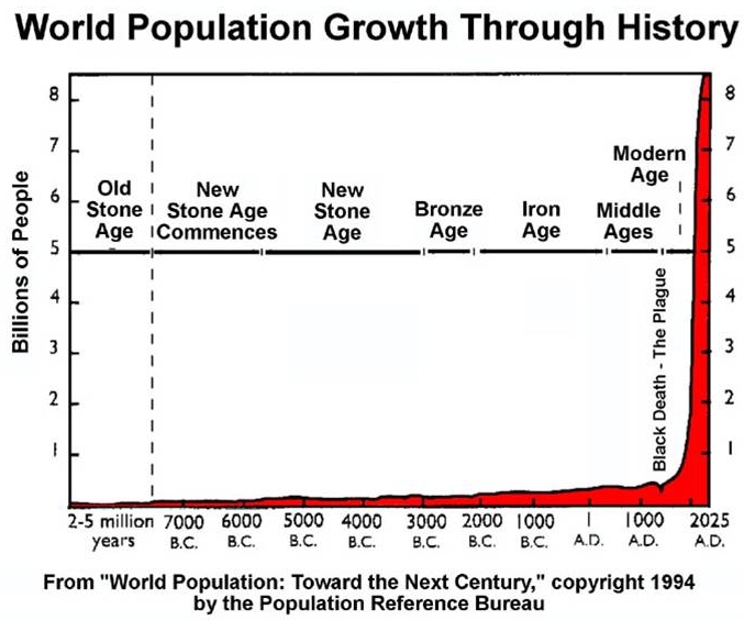
INTRODUCTION : It seems that the vast majority of people on this earth are blissfully unaware of how fast the human population on our blue marble (Earth) has been exploding --- since the 'Black Plague', and some following plagues, and various medical discoveries --- after 1350 to 1850. See the two graphs below. |
|
That little dip, around 1400, when the big European plagues started, was a huge thing at the time. But, in terms of population impact, from the point of view of someone looking back from the current vantage point, about 600 years later, the plague did not slow down human population growth much at all. See the "we are here" graph below.
|
|
LOG PLOT : If you took some algebra in high school, you may remember that if we plot data points that represent exponential growth on a 'logarithmic y scale', the 'log plot' curve should look like a straight line. However if you plot human population growth in a 'log plot', you will see that human population is still growing above a straight line that you would draw through data points from about 1000 B.C. to about 1000 A.D. See the log-plot graph below. In words, human population on Earth is growing much faster than exponentially, from year 0 to year 2010.
So when you see the phrase "human population is growing exponentially", you can see, from the log plot above, that that is a gross understatement. A statement like "human population is exploding" does not adequately convey how fast the growth is. Most people probably have a rather subdued image in their minds of what "exploding" means in the case of human population growth. BI-LINEAR LOG PLOT : Note that the log plot is basically a 'bi-linear' plot. It indicates a relatively slow exponential population growth rate up to about the 1800's to 1900's. Then the human population got a huge 'growth spurt'.
I believe this is due to a number of factors that prolonged human life, thus allowing for more births per generation. For example:
And many areas of the world have not experienced these improvements to the fullest. So the 'growth spurt' may keep on spurting for a few decades. |
|
NON-LOGARITHMIC INTERPRETATION : If logarithms do not have much meaning to you, see the comments on the graph below. Note that it took about 123 years for the world human population to go from 1 billion to 2 billion --- from about 1804 to about 1927. But nowadays, in the 1950 to 2050 timeframe, we are adding about a billion people every dozen years --- that is, about 10 times faster than only a couple of hundred years ago.
BIBLICAL VIEW : Even if you take a strict biblical view --- that man did not exist on earth before about 5500 B.C. --- the growth picture is the same. You can click on the chart below to see an enlarged version, on which you can see various biblical events and personages labelled along the graph --- including Adam, the Flood, Moses, and Jesus. (The pre-Flood population figures are going to be quite controversial to anyone who wants reasonable corroborating data.) |
|
Data Sources: Since census data became available for many countries of the world only in the 1900's, you might wonder where the population data for these graphs came from. There have been quite a few people through the last several hundred years who have put together estimates of world population for previous centuries. You can use Wikipedia (en.wikipedia.org/wiki/World_population) as a starting point for information. And a specific reference, from the U.S. Census Bureau can be seen here (www.census.gov/ipc/www/worldhis.html). It cites about seven different sources (Biraben, Durand, Haub, McEvedy, Thomlinson, United Nations, and U.S. Census Bureau) for data points between 10,000 B.C. and 1950. There is plenty of good data for the period of about 1700 to the present --- especially for large cities and metropolitan areas, such as London, New York City, Paris, Tokyo, Mexico City, cities in China, cities in India, etc. etc. If you looked at graphs of population growth in those areas, you could quickly convince all but the most un-convinceable that there is exploding human population growth --- at the recent exponential rate indicated in the above world population graphs. Implications of Human Explosion - More of Some and Less of Other : Most humans do not seem to be aware of the rapidly approaching implications of this accelerating human population growth --- namely,
DIRECT relations : The profile of the human population curve is mirrored in the curves of energy consumption, energy costs, ocean pollution, temperature rise, garbage accumulation, sewage effluent, and many other effects related to human population growth. Someday I may add graphs here that demonstrate how closely those graphs correspond --- over a segment of the time axis --- to the graphs of human population growth. In the meantime, you can try some 'image' WEB SEARCHES on keywords like the following: If you do not see any graphs with one of these queries, try clicking on an 'Images' link, if any.
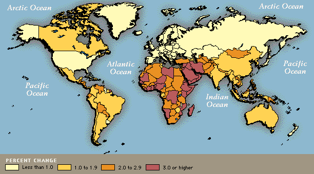
INVERSE RELATIONS: The profile of other curves --- like the population of large undomesticated mammals, such as bison, rhinos, tigers, lions, elephants, leopards, cougars, whales, manatees, etc. --- show a huge decline in the 1800 to 2000-plus timeframe, just as the human population has exploded. Over the centuries, we have pretty good data on human population numbers because ever since taxes have been collected, the tax collection process motivated a need to know how many tax payers there are. Unfortunately, since these mammals do not pay taxes, the population data for them is rather spotty. However, we do have rough data for many species. For example, it is known that there were on the order of 30 million buffalo (bison) in North America before the U.S. built a railroad across the country. Immense slaughter ensued --- resulting in a population of about 3 thousand (or less) by the mid-1900's. Thanks to Ted Turner and his many ranches in the West, the buffalo population has increased to about 30 thousand --- still about a 1,000 times less that it had been at its peak. If you plotted this rough data, you would see the 'inverse relationship' of buffalo population to human population --- human population explodes and buffalo population 'craters'. Someday I may add graphs here that demonstrate how closely those graphs correspond INVERSELY --- over a segment of the time axis --- to the graphs of human population growth --- even if I have to use very-spotty data. In the meantime, you can try some WEB SEARCHES on keywords like the following: If you do not see any graphs with one of these queries, try clicking on an 'Images' link, if any. Or replace the keyword 'graph' by the word 'data'. Some Population Maps: The map below indicates the countries where most of the growth is occurring. Note that most of the fast growth is in Africa and the Middle East --- the explosive zones, one might say. |
|
Growth is relatively low in the U.S., Europe, Russia --- and Greenland. COMPOUNDED GROWTH : A 2 to 3 percent annual growth rate does not sound like much --- but it is going to lead to enormous strains on the resources and quality of life on our "blue marble". Compounded annually, a 3 percent growth rate is about 1.03 to the 10th over 10 years, which is a 34 percent increase --- a factor of 1.34 increase over 10 years. And, compounded annually a 3 percent growth rate is about 1.03 to the 50th over 50 years, which is a 338 percent increase in the population --- a factor of 4.38 increase over 50 years. With a world population of about 8 billion in 2018, this means that the world population around 2068 may be around 4.38 x 8 billion = 35.04 billion. It is interesting to note that back around 1679 (around the time of Isaac Newton, "the Father of Gravity"), "the Father of Microbiology", Antonie van Leeuwenhoek, calculated that about 13 billion people would consitute over-population for planet Earth --- an amazingly believable prediction given that, at 8 billion people around 2018, our planet is exhibiting definite signs of stress. As we approach 30 billion people this century, we can expect lots of stress --- wars, riots, displacements, pandemics: The Four Horsemen of the Apocalypse 'so to speak'. Note that Leeuwenhoek probably gave a 'too-optimistic' over-estimate of the point of over-population by quite a bit. It is probably much closer to 8 billion people --- that is, significantly less than 13 billion people. Note that before about 1890, there were no cars and trucks. If anyone had a 'personal transportation aid', it was probably a horse. Nowadays (circa 2018) there are more than 4 billion cars and trucks on planet Earth. Note that you can ride a horse to the grocery store and back, and when you put your hand on a horse he may feel warm --- maybe about 110 degrees Fahrenheit at the most. If you drive a car to the grocery store and back (or a semi-truck up the East Coast), when you put your hand on the muffler or engine block, you will burn the holy heck out of your hand --- 100's of degrees Fahrenheit. In other words, back in Leeuwenhoek's time, the average amount of heat generation from each person was about the equivalent of one-man-plus-one-horse. In contrast, in today's world, with cars and trucks with engines rated at about 300 horsepower or more, the amount of heat generation from each person is about the equivalent of one-man-plus-many-horses. In summary, Leeuwenhoek did not take into account each man becoming a prodigious heat generator (he did not anticipate man going into the industrial-steam-coal-oil-gas age) --- and he did not take into account the effect of those factors on the LIMITED thin layer of atmosphere covering planet Earth. If we re-do Leeuwenhoek's calculations, we will need to take into account not just food, water, and land limits --- we will need to take into account the heat generation capacity of the average man, and take into account the effect of that heat generation on planet Earth --- and its very-thin-shelled atmosphere. The map below shows the most populous countries in darker shades of blue. The U.S., Russia, and Brazil seem to have similar population levels --- about a quarter of a billion people each. China and India, the only two countries to have a population greater than 1 billion, together possess more than a third of the world's population.
Heaven help my children. May they and their fellow world-dwellers find a way to cope with this situation and keep our blue pearl blue. Something You Can Do : Unfortunately, the media (newspapers, magazines, TV, etc.) have been unbelievably remiss in getting the word/vision out about how fast the human population is growing --- and how it explains the effects we are seeing now:
Viewers of this page can help get warnings out by downloading this page's graphs and send them to their local newspaper (letters to the editor) --- and post images and links on web sites like Facebook, Pinterest, Instagram, Snapchat, Reddit, etc. --- and send emails and texts to friends.
NOTE: Global disposal and recycling solutions need to be devised now. For humanity's sake, someone please develop biodegradable plastics. That should be a top-priority, well-funded project for the 21st century. |
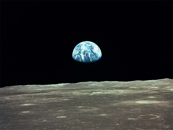
Our precious blue marble ---
with a thin, delicate atmosphere.
|
Bottom of this
To return to a previously visited web page location, click on the
Back button of your web browser, a sufficient number of times.
OR, use the History-list option of your web browser.
< Go to Top of Page, above. >
Or you can scroll up, to the top of this page. Page history
Page was posted 2009 Jan 05.
|