
Unusual, Interesting MAPS |
Home page >
Picture Categories menu >
This Map Images page
! Note !
More maps may be collected here, someday.
In the meantime, you can use WEB SEARCH link
below to look for more maps such as these.
|
Introduction: The following maps are of special interest to me because they are unusual and/orinteresting --- or because they relate to some place or occurrence in my life. Some are animated maps, which add a time dimension to the typical two geometric dimensions of maps. Some are "relief" maps that add a third geometric dimension by use of shadows. And some are both --- animated-and-relief maps (4 dimensional maps --- OK, 3-and-a-half --- the height is simulated by simulated shadows). Some of the maps convey a sense of history as an animated sequence of historical events. Information conveyed by some of these maps may be unpleasant, depending on your point of view. For example, the animated 'right-to-carry' map at the bottom of the page. In short, these maps trigger a variety of intellectual responses and emotions. Each map represents quite a bit of work by the maker --- to collect and organize the data. Hopefully, many of these maps will be of interest to you. Perhaps some will change the way you look at the world. |
This map indicates the growth of wealth
in regions of the world from 1975 to 2002.
Note the huge (fat) size of Japan, South Korea,
China, India --- and the United States, England,
France, Spain, Germany, Northern Italy.
It looks like Portugal, Belgium, and Holland
didn't do too badly either.
Note the extremely small size of Africa --- and
small size of South America and Australia.
Generally, the southern hemisphere has not
done well, with the exception of the
Malaysia, Indonesia area.
If this map went to 2006 or beyond, China
would probably be grossly obese.
China looks about as prosperous as the U.S.
This is probably because the map is depicting
wealth per square mile (or kilometer).
Since the population density of China is so
high, that makes up for its lower per-capita income.
This would explain why Australia is so lean.
It has vast expanses of unpopulated land,
and those areas may shrink to zero because of
no wealth-growth. On that basis, Africa
takes a big hit, because the Sahara desert
would shrink to nothing on the map.
Here
is a PDF of the wealth-growth map (1975-2002).
It includes a description of the map along with
a table and bar chart. You can use the zoom-in
option of a PDF reader to see the small print.
Here
is an external link to the University of
Sheffield (England) "Worldmapper" web site that
is a source of maps like this. For example, see
the "Population" map for another perspective
of the world.

This is an animated-GIF world map depicting
growth of the world population, from the year
1 to 2020. Each black dot represents a million people.
Here
is a link (at desip.igc.org) to a view of
each of the 8 frames in the animated GIF.

This is a view of world population growth in
x-y graph form.
This probably shows the recent rate of growth
more clearly than the animated GIF.
It's going to be a wild ride --- these next
20 years or so. Poor planet earth ---
and all its denizens.
You can find many charts like this on the Internet
by doing a WEB SEARCH and using keywords such as
'world population growth graph'.
In fact, that is how I found this picture.

This is an animated-GIF map of the migration
of Hawksbill turtles, in the area of
Panama and Mexico, in the Gulf of Mexico.
Here
is a link (at www.cccturtle.org) to
more information on the turtles in that
"project", about 4 turtles.

This is an animated-GIF map of the migration
of turtle "Shelldon", from Panama all the way
to the Northeast United States area.
Here
is (at www.cccturtle.org) more information
on Shelldon and the paths of about 15 other turtles.

This is an animated-GIF map of the Settlement of
the United States, 1650 to 1983
--- indicated by formation of counties.
Here
is a link (at www.cyndislist.com) to more
U.S. maps like that map (animated and un-animated).

This is an animated-GIF map depicting the
progress of a solar eclipse over the
surface of the Earth --- an actual eclipse
of 3 Oct 2005.
Here
(at sunearth.gsfc.nasa.gov) is more info on
solar eclipses for the decade 2001 to 2010
--- as well as info on lunar eclipses and moon phases.

This is a map of Greek colonies
around the Mediterranean sea, circa 550 B.C.

This is a map of the empire of Alexander
(the Great Macedonian), circa 323 B.C.
CLICK HERE to see an animated GIF map
depicting the travels of Alexander the Great
and his army --- from 356 to 323 BC.
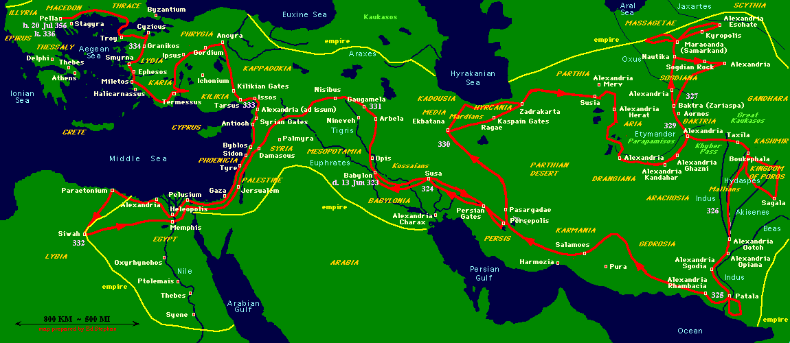
Here
is a larger, non-animated map showing
more detail (cities) in the regions of
Alexander's travels --- from 356 to 323 BC.
Here
is a site (at home.triad.rr.com/warfford/)
with historical details of Alexander's life.
For even more information,
here (at en.wikipedia.org) is
the Wikipedia entry for Alexander the Great.
Here
(at www.let.leidenuniv.nl) is another site
that refers to the animated map of
Alexander's travels --- as well as referring to
many more maps depicting
international migrations through the ages.
CLICK HERE to see the track of Captain Cook's
2nd voyage around the world, 1772 to 1775.
Here
(at www.nmm.ac.uk) is more info on Cook's voyages ---
at the web site of England's National Maritime Museum.

This is an animated lightning-strike map of
a storm over New Zealand, 15 Nov 2004.
You can probably find more current lightning
strike maps (and other such weather maps)
by using a WEB SEARCH on keywords such as
'map animated lightning'.

|
This is an animation of average temperature,
for each month of the year, at points over
the surface of the earth.
HERE
(at www.learner.org/jnorth/) is a source of
that temperature map --- at a site that
is concerned with robins and their migration.
HERE
(at www.metasphere.net) is a site with
48-frame animated-GIFs of U.S. weather
patterns in the past day or so.

This is an animated map of spread of dams
in the U.S. Northwest --- 1930, 1965, 1998.
HERE
(at www.sightline.org) is the site from which
that dam map came (pun intended).
It is a site with more maps, related to
energy efficiency and climate change.

This is an animated-GIF map showing
the "progress" in the right to carry firearms
in the U.S, state by state, in a 20 year period
--- 1986 to 2006.
Here
(at www.gun-nuttery.com) is the
gun-nut site from which that map came.
|
FOR IMORE MAPS: To find more maps such as these, you can do a WEB SEARCHES on keywords such as the following. After doing any of these searches, you can add or change keywords to do searches more to your liking. |
|
Bottom of this
To return to a previously visited web page location, click on the
Back button of your web browser, a sufficient number of times.
OR, use the History-list option of your web browser.
< Go to Top of Page, above. >
|