JavaScript QUERY RESULTS
for Some Web Browsers
on Various Devices
(smartphones, desktop computers,
laptop computers, tablets, ...)
JavaScript QUERY RESULTS
for Some Web Browsers
|
|
! Note !
More JavaScript-DOM query results may be added in the future
--- perhaps for other browsers on other devices.
|
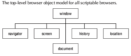
INTRODUCTION : Before the advent of 'small screen devices' like 'smart phones' (with web browsers), the development of web pages was mostly targeted at desktop and laptop computers with a rather small range of monitor resolutions (less than a factor of 2 different) --- and usually in a 'landscape' orientation. (Nowadays resolutions can be 400% or more different --- 640 pixels to 3200 pixels and more.) The task of web page developers was already getting pretty challenging. In the early days (circa 1990's), knowing the basics of HTML was sufficient to produce some quite useful web pages. But then, to make 'dynamic' web pages, along came the JavaScript 'language' --- originally called 'LiveScript'. And then, to help separate 'styling' of web pages from the content and basic HTML tags (like <body ... > and <p ... > and <a ... > and <img ... >) along came CSS = Cascading Style Sheets 'language'. Furthermore, using JavaScript and CSS required learning a lot about the hierarchical DOM = Document Object Model --- AND the even-less-standardized BOM = Browser Object Model. These learning curves were time-consuming and challenging enough --- especially considering the fact that various browsers (two main ones initially - Netscape and MS Internet Explorer) implemented slightly different versions of JavaScript and the DOM and the BOM. BUT THEN . . . Since about 2005, the task of the web developer has become much more complex as 'small screen devices' with even more web browsers (such as 'Chrome' and 'Samsung' browsers on Google Android --- and the 'Safari' browser on Apple iPhones and iPads) came on the market. These devices (and browsers) offered both 'portrait' and 'landscape' ways of looking at web pages --- and offered a wide variety of screen resolutions (that is, pixel dimensions and densities). The evolution of JavaScript and CSS to handle these new devices has resulted in a plethora of new and 'deprecated' (discarded) language 'features' to handle supporting a wider variety of devices (and browser implementations). Up to current times (circa 2018), the web programming forums (such as StackOverflow.com) are loaded with questions on how to handle the challenges raised by the 'small screen devices' --- and most of the time the answers are not clearcut. The answers offered by forum participants often far out-number the questions --- often with no 'clearly right' answer emerging. A nagging question that often remains: Maybe that works with your browser-and-device, but how about another browser-and-device? And how about on 'wildly different' web pages? It is safe to say that CSS and JavaScript (and DOM and BOM) will probably need until about 2025 to provide 'language features' that 'gracefully' handle the wide range of devices --- from smart phones through desktop monitors to stadium-sized scoreboards --- in particular, to arrive at clear-cut standards on how to generate readable text on the wide range of devices (and both 'portrait' and 'landscape' orientations). This will require web-browser implementations to also evolve during that time period --- so that the browsers become 'part of the solution' and NOT 'part of the problem'. Hopefully, the 'text-inflation' algorithms being implemented within web browsers will go the way of the do-do bird --- or, at least, be made an 'opt-in' feature rather than an 'opt-out' feature that the web developer has to figure out how to disable. 'Text inflation' should have been considered 'experimental' and implemented as an option --- NOT forced on web developers as 'the default'. See the 'bug reports' on web browser development forums to see the 'bag of worms' that was opened by the over-confident people who decided to make 'text inflation' the default (instead of 'experimental'). To get some sense of the issues, you can browse some 'bugzilla' reports on text inflation. A Main Reason for this Page: To handle the task of programming for a wide variety of browsers and devices, it becomes necessary to be able to query the devices --- via the browsers --- to determine certain properties --- especially properties such as screen (or window or viewport) width and height --- or, at least, device orientation (portrait or landscape). This page is intended to publish some results of DOM/BOM property queries --- for various devices and browsers --- in tables below. Unfortunately, in 2018, we can query screen/window/viewport width and height in PIXELS, but not in distance units such as INCHES or centimeters. And even the pixel-queries often are answered in 'virtual pixels' instead of actual pixels. Some of these issues are discussed on a Screen DPI page. Below are the results of some queries --- grouped according to browser-and-device(-and-orientation), such as
The results were obtained using a web page that
A query on the object 'navigator' showed that property 'userAgent' is
Mozilla/5.0 (Linux; Android 6.0.1; SAMSUNG SAMSUNG-SM-J320A Build/MMB29K) for the 'Samsung Internet' browser on a Samsung phone. (It looks like the 'Samsung Internet' web browser is trying to masquerade as every major web browser 'out there'.) And a query on the object 'navigator' showed that property 'userAgent' is Mozilla/5.0 (X11; Linux i686; rv:13.0) Gecko/20120604 SeaMonkey/2.10 for the 'Mozilla-Seamonkey' browser on a desktop computer. The 'resolution' of the monitor attached to the desktop computer was 1024x768 pixels. A phone specs page indicates that the Samsung J320A phone (the 'J3') has a 'display resolution' of "720 x 1280 pixels, 16:9 ratio (~294 ppi density)" . |
| Properties | Samsung-portrait | Samsung-landscape | Seamonkey-landscape |
|---|---|---|---|
| window.innerWidth | 1440 | 1776 | 1024 |
| window.innerHeight | 2048 | 644 | 543 |
| window.outerWidth | 360 | 640 | 1024 |
| window.outerHeight | 512 | 232 | 694 |
| window.devicePixelRatio | 2 | 2 | N/A |
| screen.availWidth | 360 | 360 | 1024 |
| screen.availHeight | 640 | 640 | 718 |
| screen.width | 360 | 360 | 1024 |
| screen.height | 640 | 640 | 768 |
| document.body.clientWidth | 980 | 980 | 1024 |
| document.body.clientHeight | 1676 | 514 | 507 |
|
COMMENTS : I may put more comments on the above table here, in coming months/years. For now, I mainly want to point out that 'window.outerWidth' and 'window.outerHeight' seem to be good indicators of whether the Samsung smartphone is in 'portrait' or 'landscape' orientation --- while 'screen.width' and 'screen.height' are NOT good indicators of orientation. It looks like 'window.innerWidth' and 'window.innerHeight' on the Samsung smartphone are measured in some kind of 'virtual pixels' --- because these numbers (especially the Width's) are much larger than the possible 'real' widths in pixels indicated by the '720 x 1280' specs of the smartphone. Note that you have to multiply the 'screen' units by the 'devicePixelRatio' (2) to get the '720 x 1280' specs of the smartphone. I may add some results someday --- for web browsers on an Apple tablet and on 10-inch and 11-inch Acer netbook computers. |
|
Bottom of the page
To return to a previously visited web page location, use the
Back button of your web browser a sufficient number of times.
OR, use the History-list option of your web browser.
< Go to Top of Page, above. >
|